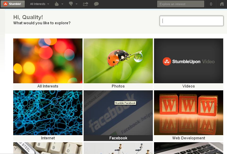
Content discovery engine StumbleUpon has made significant changes to its looks. This new updated service from StumbleUpon looks more visually appealing than the previous versions. And interesting features like “channels” have been included that makes the user experience a more comfortable one.

This is most significant updation that StumbleUpon has done to its user Interface since it came out of it’s corporate parent eBay two and a half years ago.In a recent interview about the changes StumbleUpon CEO Garrett Camp stated that
“We realized we weren’t conveying the experience well enough through our visual appearance. The power of our technology is remarkable, but now we’re finally doing justice to that with a modern, slick front-end. Finally, our front-end is as good as our back-end.”
StumbleUpon’s traditional logo which had green and blue colors has been changed to an orange one with an initial inscribed on it. But the biggest surprise changes are its new channels. These channels have been designed to increase the user experience further by helping them to funnel the required web content. It helps the user to fine stream the web content that the user needs.
If the user needs only php web content then he can subscribe to that channel alone and there is no need to select all the whole programming channel. In such a way user can get their required web content with minimum fuss. And in the recent press release StumbleUpon has stated that it has planned to add many more channels in the forthcoming months.
Many term this redesigned look and feel of StumbleUpon as a brilliant attempt. Taking into account of the fact that in the last 10 months 10 million users have registered with their service to the existing 20 million users and hence these kind of updations are mandatory to keep themselves up in the race.

